
OPES
London’s leading financial intermediaries since 2011.
The Challenge
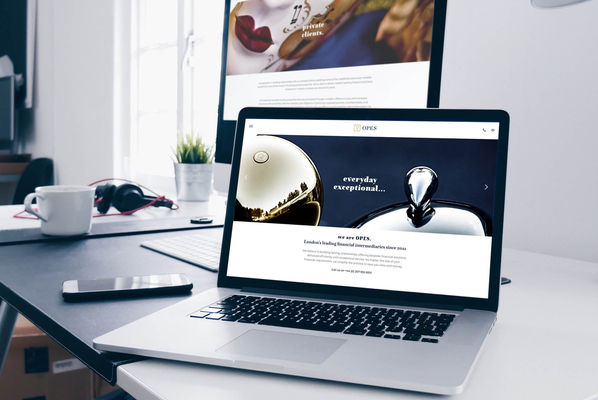
A distinctive rebrand and website were required for London’s leading financial intermediaries, OPES.
Our Objective
To create complete standout for OPES within the relatively conservative financial sector.
Branding
For the logo, we built on their original logo mark, inspired by the ‘rune’ symbol of wealth. We added to this a classic serif font in all capital letters for an overall confident and dependable feel.
In developing the overall branding we curated a selection of striking, abstract imagery to engage with the emotive side of a wide range of clients and to ensure cut through in all communications.
Website
To achieve maximum engagement, we started by making the UX straightforward and as simple to navigate as possible. On the design side, we created a clean contemporary overall look for the website in order to offset the brand’s unusual, eclectic style of imagery supporting the company’s endeavour to engage with a broad range of clients.
The brand roll-out also included stationery and business cards.